Like any of us, you've probably looked at plenty of photos of miniatures on the internet. What are some of the things that make bad photos? Poor lighting, blurry, out of focus... these jump to mind immediately. There's something else that professionals have picked up on which sets them apart from others - backgrounds.
The right (or wrong) background changes how we perceive ours and others' figures. If the miniature is infront of a background that's too strong or too busy, then the viewer's eyes will be drawn away from what's important - your miniature.
I've scoured old (and newer) photos of my own miniatures and have taken a critical stand on things I've done wrong when taking pictures... and we'll look at some advanced ways to make your own backgrounds.
Anything extra you include in your picture means that your miniature is no longer the focus.
 What do you see when you look at the photo on the left?
War Walkers, yes... a big white monitor screen... bitz box... tool carousel... glue... and lots of other little things that distract the eye.
Sure, it's a photo WITH 3 War Walkers... but it's not necessarily a photo OF 3 War Walkers.
 Your background should be simple
Keep your background as uncomplicated as possible.
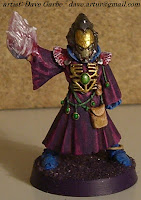
In this photo, the Warlock is standing on some white metal with a piece of wood behind it.
It's not a perfect background. There's two different colours which are slightly distracting and the black (shadow) line through the middle, but it's not bad.
For someone with limited space, this is actually a great option. My painting station is an old external metal computer drive and a block of wood to raise things up. When I wanted to take pics, I just flip the wood up, snap some shots, and stack things up again.
If the colours in your background match those of your miniature, it'll fade away.
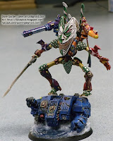
Both these images show how parts of a mini can blend in to the background.
The blues, reds and greens of the Autarch on the left really "pop". The helmet disappears a little and the wings fade away.
On the right, the Phoenix Lord's upper body stands out, but his lower half blends in to the ride side.
A unit of models side by side is like a line up of people. Easy to take a picture of and easy on the eyes. If a squad is in some kind of formation, multiple things go wrong.
There is way too much going on here.
First, details are lost if models are infront of others. Second, your own models become part of the background clutter. Third, squad mates are usually painted similar, helping to emphasize the clutter and cause everyone to blend in to eachother.
Here's a better example of a squad photo - lined up and with a proper background.
 Macro focus on the foreground
This one isn't a hard and fast rule, but something to experiment with.
Your camera's "macro" setting is for taking pictures of small details but can be used to take larger shots as well.
Macro tightly focuses on the target, meaning everything else goes out of focus - blurs. A blurred background is actually a pretty good method of forcing your eyes to focus on the target.
Placing a sheet or a piece of white paper (less wrinkles) behind your mini is the fastest way to create a neutral background. (Though if not done right, can cause your mini to appear really dark. More below.)
It's a little plain, but it's simple and clean. Most miniatures will show up great against a white background.
* One warning - if your cameras white balance is set for whole area rather than target spot, your mini could end up looking very dark. (Camera averages the white background in and thinks your lighting is too bright.)
A plain white background can also appear hard on the eyes though.. sometimes it's just too strong.
All that I've done to achieve this is take a white piece of paper and curved it so the single piece is both the back and the bottom. (For it's length, Legal sized paper - 8.5" x 14" or larger - works best.)
You'll need something placed behind the paper so it's propped up, like your water cup or a block of wood. Once you place the weight of your miniature on the bottom of the paper, it'll stay in place.
We curve one piece of paper, rather than use one in the back and one below, because it creates a continuous white background. Meaning, there's no shadow or unevenness from two pieces of paper meeting up.
I touched on this in my first article on photographing your minis, but here's how you set it up:
Notice how everything is suddenly darker when I add the white paper? The camera's white balance has compensated. By using the "spot" or "center" options, and making sure your mini fills the target box in the center of your camera, the camera will correctly calculate white balance using (mostly) just the colours on your miniature.
Using the above tips on curving a piece of paper, here's a look at how a background sits in the Light Box that I made.
Now doesn't this one look nice? I'm using the (almost) exact same method as above for the white background, except I've printed an image on the paper. Nothing too strong, colours that compliment the model; just a soft back drop to take your pictures against without being quite as stark or hard on the eyes as a bright white background.
The easiest way to do this is open an image you already have in your favorite photo editor, and just turn the brightness wayyyyy up.
Here's a quick tutorial on doing it in a free photo editor called GIMP.
First things first, just open the image you want to brighten in GIMP.
Then, choose the "Colours" menu and select "Brightness-Contrast..."
You'll notice that as you turn the brightness up, the image gets much lighter. Now you just need to save and print the image.
Want a clearer idea of why I'm suggesting you do this? Look at the two following images:
The only change I've done to the colours here is lighten the background. the image of the model is the same on both sides. Using this simple technique, you'll very quickly improve the quality of your images.
* A note on the image you use as a background... it should be HIGH quality. You don't want a blocky pixellated background, right? Example of good images would be anything high-res; big enough to fill your computer's desktop or something taken with a digital camera these days.


No comments :
Post a Comment
Please keep all comments civil and language appropriate for a child-safe environment.